The production designer talks to StarWars.com about making Rian Johnson's vision a reality.
Spoiler warning! While this article is mostly spoiler-free, it discusses some elements not featured in the teasers and trailers of Star Wars: The Last Jedi.
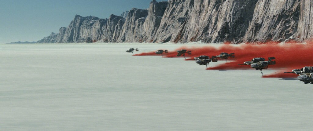
Star Wars: The Last Jedi features a visual aesthetic rooted in Star Wars traditions, but modernized. There's the graphic red and white of Crait, a decidedly different take on a Star Wars planet. The sleek and elegant ships and interiors of the First Order, which recall the Empire but are darker and bolder. Entirely new vehicles for the Resistance that fit with what came before, yet look unique and strange, from ski speeders to bombers. Among the chief architects of the film's look is production designer Rick Heinrichs, who collaborated closely with writer-director Rian Johnson and helped bring these ideas to life. StarWars.com caught up with Heinrichs for a mostly spoiler-free discussion on his early talks with Johnson, designing a bridge worthy of General Leia Organa, and what Supreme Leader Snoke's ship was meant to convey.
StarWars.com: What can you tell me about your initial conversations with Rian Johnson and what you were going for visually with The Last Jedi?
Rick Heinrichs: My initial conversations with him [were] interesting. I'm just very used to, in this industry, starting a project with one script and one set of paradigms and challenges and, you know, the script will often times go through many permutations and you end up doing things you really had no idea you were going to do at the beginning, and then not doing some things you thought you were going to do. What was interesting was, Rian, when we met initially, he gave me like a good 30-minute pitch about the movie. And the amazing thing is we're here three years later and, basically, the movie is, by and large the same movie he pitched me three years ago, which is so unusual. I think that I chalk that up to a combination of a writer-director, which is also pretty unusual in our industry.
There's a very clear graphic sensibility that I think people are responding to in the trailers and the graphics for the poster and everything. That's certainly a combination of the different creative people involved, but it's very much Rian and, really, his initial pitch, which like I said hardly wavered at all. We discussed things about how we were going to achieve them, and some of the solutions varied as we explored exactly how to achieve what it was that he was after, but he remained fairly steadfast to his initial indications and desires, simply because it felt right to him. For instance, the sense of the red against the white. Star Wars is, in many respects, kind of a black hat/white hat sort of world. It has a very stark and simple color palette. It's a little more complex than that, but it's always good with Star Wars to sort of diminish things to their simplest form and there is a very strong black-and-white feel to it.
StarWars.com: Did he have that idea early on or is that something that kind of evolved?
Rick Heinrichs: No, that was early on. And it's just a combination of what looks good in space, I think, along with this very Star Wars element of finding these almost unearthly environments on Earth, and being able to go to those locations and actually shoot them, so that there is that almost documentary-style feel to the way the drama unfolds. That's very much something that [George] Lucas was after in the initial films. And there's an immediacy to that that really fits in well with Rian's own approach.
We were all trying to get as much in-camera as possible, so that nothing ever took the audience out of that moment, and that there was always almost that documentary-style immediacy to the proceedings. Lucas started that. It's all very much his ethos of making the audience feel like they're entering into a very specific moment and being introduced at lightning speed to characters who have to figure out where they're going from there. It's kind of the excitement of being thrown into the middle of things.
StarWars.com: How did you maintain a visual continuity with what came before while creating new elements, and also this very original look?
Rick Heinrichs: Well, I think that the language of a Star Wars film, the graphic language, the way the details are presented… There's a very sophisticated approach to how tech is approached. It's done in a very graphic way that doesn't necessarily invite the audience to study it too hard. It just looks really cool as a background element. And it doesn't get the audience hung up on the hardware, if you will. There's this language of the Star Wars films and that's one example of it. A visual language that… It feels like Star Wars, you know? I could probably describe it, but I think the most important thing about it is the fact that we all respond to it as, “That's Star Wars!” And there's just absolutely no mistaking that for Star Trek or something else. It's an almost simplistic and a metaphorical approach to graphic shapes, space ships, the sharp angles and dagger-like quality of the Empire/First Order shapes, and the more curvilinear and somewhat friendlier shapes that you want to associate with the rebels and the Resistance. That’s part of the visual language of Lucas' approach to the Star Wars films and that's what we learned. So that just went deep into our DNA and from that place, and from having that as a basis upon which we then built, we were able to bring in new ideas, new organic approaches to things.
StarWars.com: Do you remember, whether it was a ship or a planet or whatever, the first element of the film that you worked on and had to realize?
Rick Heinrichs: Yeah. My approach is, usually, to find the toughest things that we're going to have to approach and just sort of hit them all at the same time, even if we're just picking away at them, trying to figure out exactly how to approach them, even if they’re not necessarily revealing themselves right away. So that was true of several of the creatures, particularly having to figure out the ones that affected the environments. That's why I had to approach them. There is one particular character I'm thinking of, that is in fact in one of the behind-the-scenes [featurettes] that you can see online, that we had to basically kind of build the set around in a certain way, and our locations and how we were going to be approaching a lot of different things. So while [head of the creature shop] Neal Scanlan was busy with Rogue One, we moved forward with designs for several of those characters and had a sense of their physical scale and proportion and nature. By the time [of shooting] we were then able to approach the environments that they exist in. It really went hand in hand, so there was that.
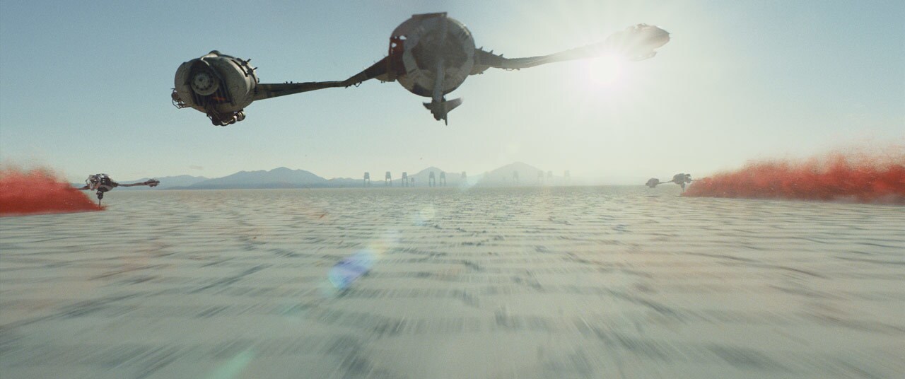
And there were also the ski speeders seen on the planet Crait that Rian had such a very specific idea for. Now when I say specific idea, he knew what he was going for in terms of feel. The actual shapes and the actual thought behind how it operates was just a little bit less clear. That's just something that kind of evolved as we went along. So we were exploring for the ski speeders. We were exploring more blade-like, skate-like ideas and it was from those early explorations, for instance, that Rian said, “No, I want it elevated. I want it to have almost like a hydrofoil quality to it.” This idea of having the cockpit offset… In a lot of these Star Wars vehicles, spaceships, there's a informal kind of asymmetry. And that's one of the sort of key things about them. They're not symmetrical necessarily, some of them certainly are, but they're surprising in their shapes, and they're also a little bit remindful of things. We're not exactly sure what, but it kind of reminds you a little bit of something else, which has sort of a metaphorical feeling to it.
StarWars.com: What can you tell me about the TIE silencer, Kylo Ren's fighter?
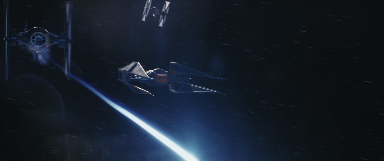
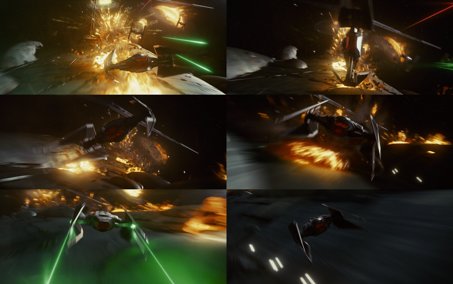
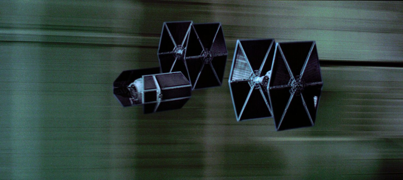
Rick Heinrichs: Well, you know the TIE fighters are an iconic part [of Star Wars] and they were very intentionally updated for number VII, for J.J. [Abrams]'s film, and they looked really cool and it was used in a really great way for that film. But we felt it was very important for Kylo to have kind of a signature look in the same way, really, that Darth Vader did in A New Hope when he suddenly appears [in the space battle climax]. We wanted that to have a bit of the same impact that that vehicle did at that time.
StarWars.com: It's very cool.
Rick Heinrichs: Yeah, it's a very cool thing and it actually kind of streamlines it a bit. Rather than a big ball shape with bagels on the sides or these sort of wings on the sides necessarily, in the same way that they did in the original films, we did try to streamline it. There's a bat-like quality to it, essentially, that we were kind of going for and that added a little bit of a sinister effect that felt right for Kylo. But yeah, when we're in the process of designing stuff, sometimes we don't get a chance to actually see them move around until the trailers come out. I love the way that Rian and the visual effects [team] have taken it and are using it. It's almost like Kylo's having fun with it, spinning it around as he's expertly kind of Top Gun-ing it around the Resistance cruiser.
StarWars.com: It also looks appropriately modern when you put it side by side with the classic trilogy TIE fighters.
Rick Heinrichs: Absolutely. Well, one of the things that happens with our popular culture is very strong, popular culture elements like the TIE fighters and all the Star Wars stuff, really almost become a part of the signature zeitgeist, graphic base of a period. And I think that's certainly true of that time, and if that's the case for the stuff that we were developing for number VIII as well, that would be fantastic.
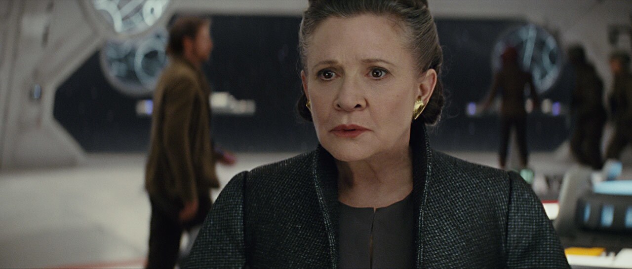
StarWars.com: The bridge on Leia's ship. I'm curious because it looks clean, which is not what we're used to with rebel/Resistance craft or headquarters. What can you tell me about the design of that?
Rick Heinrichs: It is clean and it's something we thought a lot about. There were a lot of different influences, and certainly one of them is Admiral Ackbar's vehicle [from Return of the Jedi], but within the context of our film, the cleanliness is going to make sense. I can't really tell you any more about it for that reason. But it ends up getting contrasted in a very believable way.
But just getting back to the cleanliness of it, one of the things that I absolutely made sure to do was -- and it's a really cool thing that I've always loved that they've done on the exteriors in a Star Wars film -- is kind of called out panels a little bit with slightly different shades of the local color, and it gives it a nice feeling of believability and reality to it, as well. And that's one of the things I did on the interior. So I think, you know, when you see the film you're going to experience it in a slightly different way than you do in the trailer. You'll have the chance to see a bit more of the aging. We did intentionally try to keep it pretty clean, though. The whole point of it is it's essentially the flight deck control for the entire cruiser. And it's General Organa's domain, so it really had to represent her authority and herself, her character, in a certain way. We wanted it to have a regal quality to it.
StarWars.com: Yeah, it definitely comes across.
Rick Heinrichs: I think that when you see the people rushing back and forth, that's one of the differences that you'll see contrasting to the First Order. That's also a very striking look and that's actually, that's a lot of hard mirror surface, almost-mirror surfaces, and the use of blacks and reds and things like that. So sure, it's clean, but it is also very much in keeping with a bit of the rebel/Resistance distress. And their own costumes stand out really well then from that as a background element.
StarWars.com: I did want to also ask about Snoke's command ship, which I love. It seems kind of like a strange flip of a Super Star Destroyer or something. What can you tell me about the design of that? The Supremacy.
Rick Heinrichs: We always called it the Mega Destroyer. We put a check on ourselves in terms of just having inflation happening to the design. We weren't just trying to make things bigger and just trying to best everything by making it a bit bigger than before. I think it's very important when you're trying to impress the audience with the character of the Empire and the First Order, that they're associated with something mammoth. For instance, you've got the Death Stars, and you know, you have their fleet and all that. And in this case, the Supremacy was our way of presenting a monolithic and seemingly indestructible face for the First Order. It just needs to make anybody looking at it, whether they're Resistance or anybody else, go weak in the knees. And it's incredibly important that it put across that sense of great power and might and immovable and sinister force, which was the point of the design.
StarWars.com: It retains elements of Imperial design but it loses the strict diamond shape.
Rick Heinrichs: Sure, yeah. So that very much came from out of the process, but that was an early choice Rian made. And I think what we liked about it was, partly it feels a little bit like those old German flying wings, it has a little bit of that feel to it. There's something that I've always felt was very, almost bizarrely malignant about those shapes. It almost feels like a vast thing, almost without a head, to a certain degree. And when you've got the much pointier Destroyers, they look like the leading blade of the advancing First Order, and this feels almost like the home base. The sort of mobile base that moves along with the fleet. And so, as a result of that, it's a little bit like the bombers that we did for the Resistance, in a certain way. It was quite intentional to make sure their shape was not aggressive. Rian described them as being almost like cows. Like a herd of cows coming at you. They're not incredibly fast and they're not incredibly sharp and super dangerous-looking. They almost look like a lumbering herd of cows that just happen to be able to deliver a vast and really, truly punishing bombardment, which you get into.
StarWars.com: Is there a design in the film you're most proud of?
Rick Heinrichs: Oh, gosh. Several! I think the look of this film is extraordinary and I can take a certain amount of credit as a production designer, but one of the great advantages of working on a Star Wars film like this is that there is a legacy of people for who Star Wars just went down deep in their psyche. They just know it, and they know what it feels like and what's right about it, and it inspired them to draw at an early age, and it made them into amazing artists. So it was truly amazing to work with the group of concept artists and painters. It was both the group at ILM, and there was a large contingent of motion picture illustrators that I hired from both London and Los Angeles, and it was really just a very top-notch thing. And the reason you're able to get that top-notch group of people together is because they love Star Wars, and they just were incredibly excited about what Rian wanted to do.
Star Wars: The Last Jedi is in theaters now.
Dan Brooks is Lucasfilm’s senior content strategist of online, the editor of StarWars.com, and a writer. He loves Star Wars, ELO, and the New York Rangers, Jets, and Yankees. Follow him on Twitter @dan_brooks where he rants about all these things.


